CASE STUDY
XRIG PC
BRAND IDENTITY & DESIGN SYSTEM
Consider using this if you need to provide more context on why you do what you do. Be engaging. Focus on delivering value to your visitors.
The Brief
XRIG’s founder had a clear reference point when he described what he wanted: Apple’s Jony Ive era.
The same relationship between product design, brand identity, and consumer trust – applied to custom gaming PCs in India. XRIG needed to look and feel like a brand that understood its customers, not just a shop that assembled hardware.
The brief, in short: build the visual identity of an aspirational Indian gaming brand from the ground up, starting before a single product had been sold commercially.
The Challenge
Gaming hardware is one of the most visually saturated categories in consumer tech. RGB lighting, aggressive typography, dark color palettes with neon accents – the aesthetic has been so thoroughly copied across the market that most brands are indistinguishable from each other.
The specific challenge was designing a system that could compete visually within gaming culture while also signaling something more considered, more premium. A brand that an enthusiast would take seriously, but that wouldn’t look out of place next to the best Apple product photography.
That tension – between the energy of gaming and the restraint of premium design – was the creative problem.
The Approach
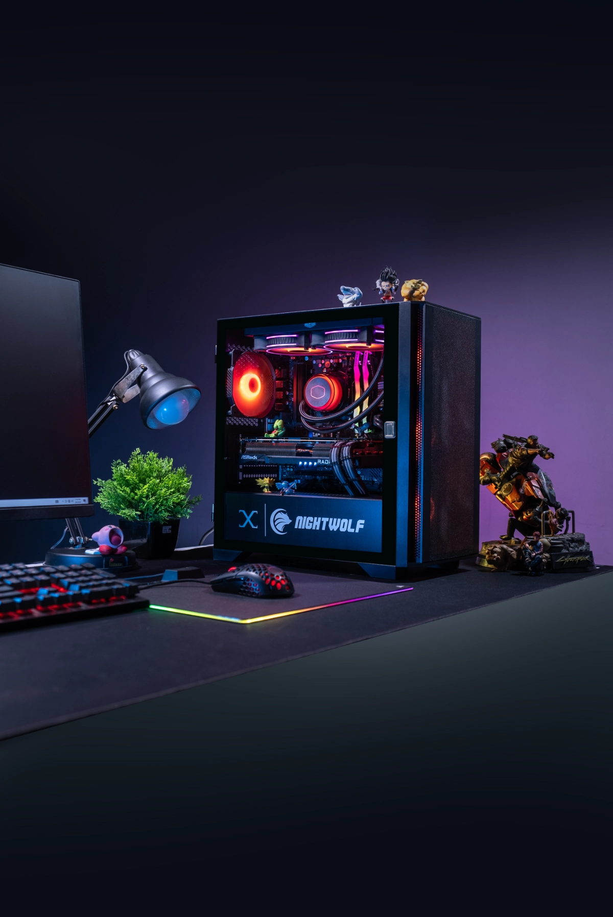
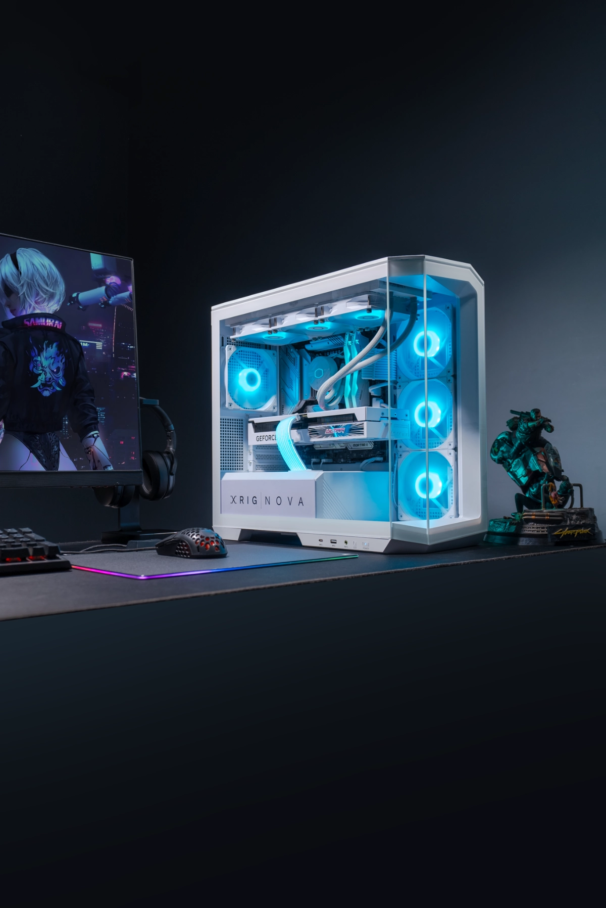
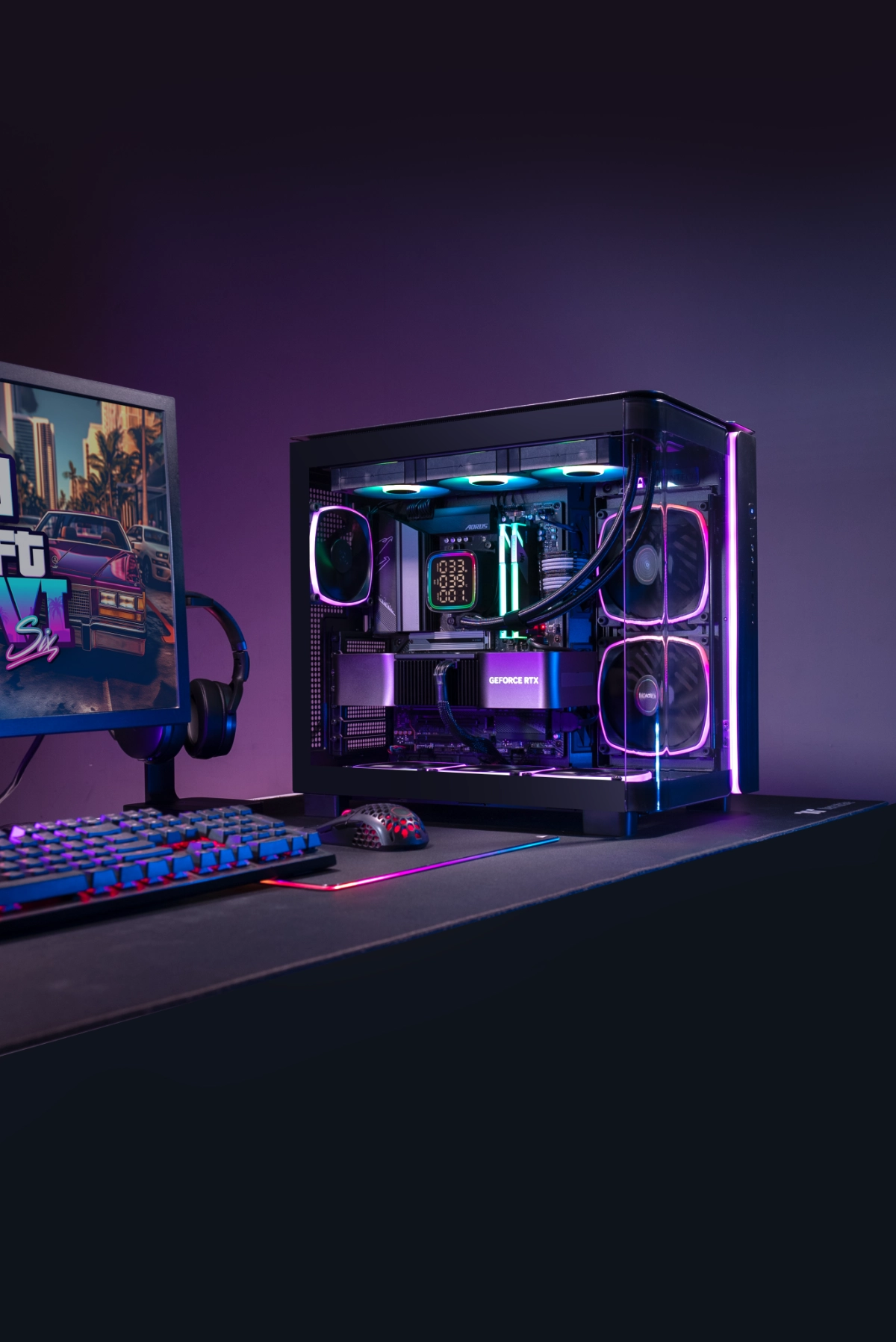
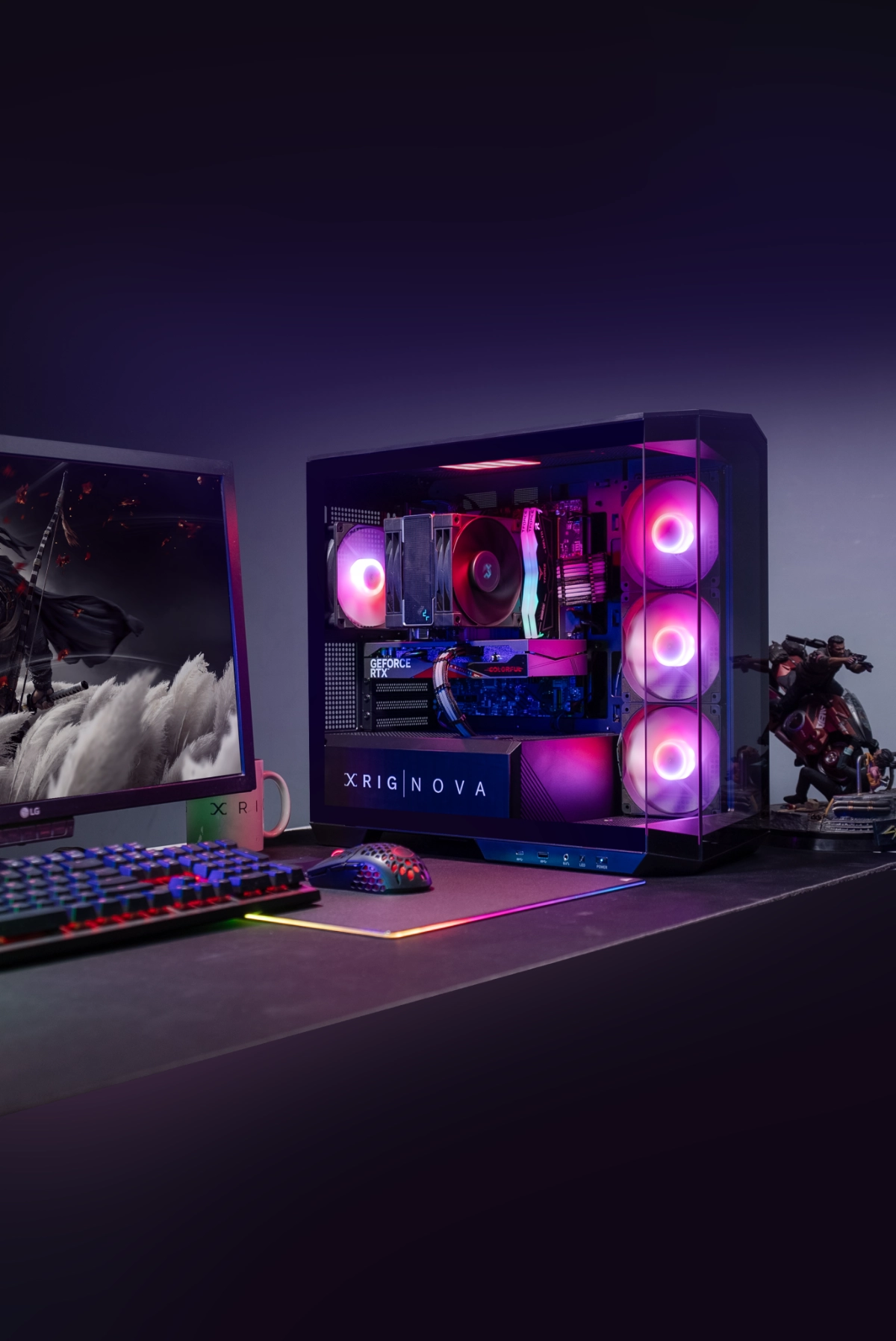
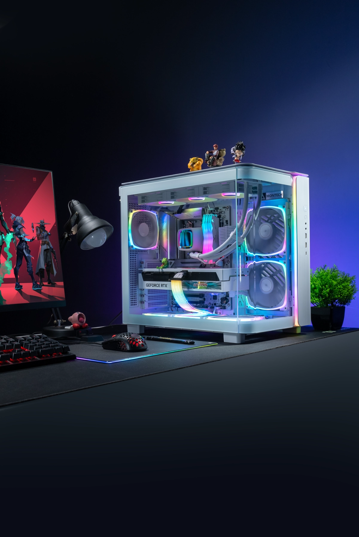
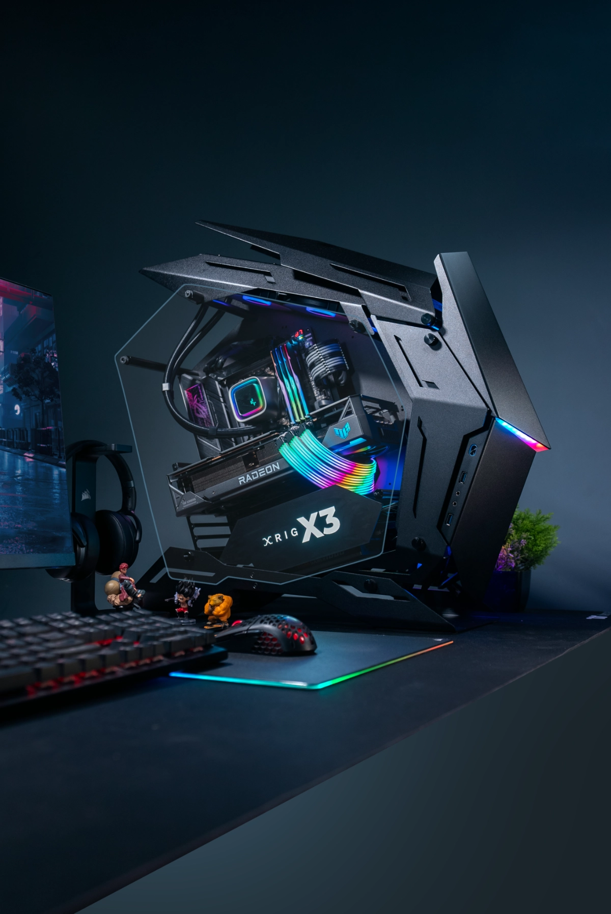
Rather than leading with aesthetics, I started with the product itself. XRIG’s early builds – Project Alpha, Project UMX, Project X – were proof-of-concept machines designed to demonstrate what premium PC assembly could look like in India.
They were my brief. I built the visual language around them: what these machines looked like in a studio environment, how light interacted with their surfaces, what kind of photography made them feel genuinely aspirational rather than just technically impressive.
The photography approach became the brand system’s anchor. We set up a dedicated studio environment at XRIG, shooting on a Sony Alpha professional camera with controlled flash and lighting for every product.
The decision to invest in proper studio photography – rather than lifestyle snapshots or manufacturer renders – was strategic. It immediately separated XRIG’s visual content from every competitor in the Indian market.
The carousel template system I designed in Photoshop and Illustrator gave every product launch a consistent structure: 10-image sequences with a repeatable format that worked both as individual scroll posts and as cohesive series in the Instagram feed. This meant brand consistency was built into the production process, not applied retroactively.


What Was Built
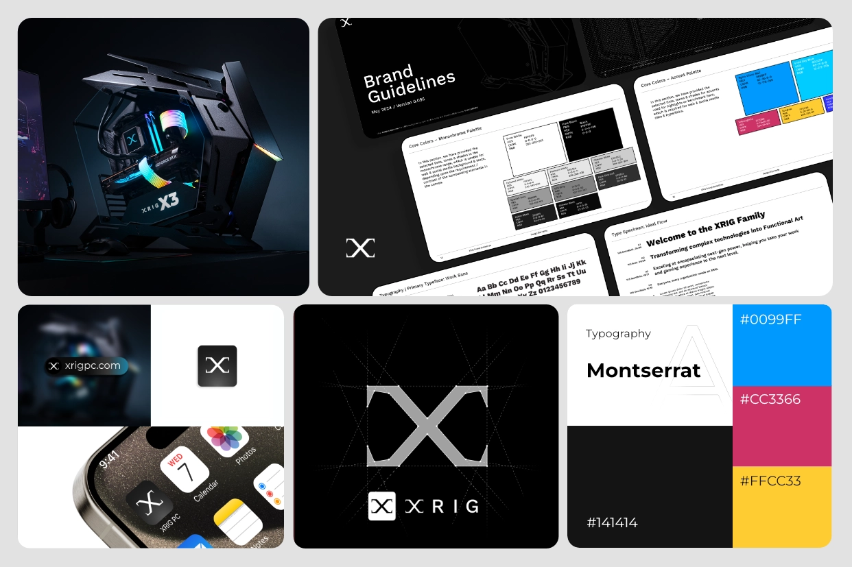
Brand Guideline
A complete, token-based design system including color palette with dynamic theming support, a modular component library, pattern documentation, a grid system for desktop/tablet/mobile, a typography ramp across all device classes, and a custom trust/assurance icon set (BIS hallmark, GIA certified, easy returns, doorstep delivery, Made in India, cadmium-free, 925 Sterling Silver, and others).
Three fully specified brand themes –
Sophisticated Classic, Royal, and Vibrant – allowing any jeweler tenant to choose a storefront aesthetic without developer involvement. Result: approximately 35% reduction in design-to-development inconsistencies, and approximately 40% faster screen production time per new feature.



Photography System
Every screen in the core user journey was designed to production-ready standard.
On desktop: full homepage with header and mega-dropdown navigation, gold rate real-time popup showing live gold rates, multi-product listing with filters and sort, single product page with six overlay types, cart, login, delivery, address management, payment gateway, profile, orders history, and store locator. Every screen carry “Technology Powered by Gold Club™” in the footer.
On mobile: the same core flows, plus an expanded hamburger navigation with category trees and visual thumbnails, mobile-specific filter panels, full cart price breakdown overlays, mobile account login and signup, and 10 loading screen variants per device class.
On tablet: homepage, single product page with all overlays, multi-product listing, cart and checkout steps, and store locator.
10 Image Carousel
Template System
All print and event materials for GoldClub’s public debut. Large-format outdoor flex (6m×8ft, VJW brand and jewelry lifestyle photography), indoor banner (5m×5ft), GoldClub Experience Zone flex (4m×8ft) featuring the app on device mockup, QR code, and tech stack logos.
Stall wall panels in bilingual English and Bengali. Business cards for three directors across multiple design iterations. Everything delivered to print-ready specification and large-format output.
Event & Editorial
Collateral Templates
GoldClub’s logo — a navy heraldic shield with gold GC monogram — was not designed from scratch, but I significantly refined and extended it: proper SVG vector files, animated GIF versions, defined primary and secondary color palette, and visual consistency rules applied across all touchpoints. The brand was effectively codified through application because I owned every touchpoint — platform screens, event collaterals, print, business cards.
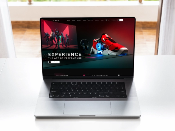
Website UX Design (Alpha)
GoldClub’s logo — a navy heraldic shield with gold GC monogram — was not designed from scratch, but I significantly refined and extended it: proper SVG vector files, animated GIF versions, defined primary and secondary color palette, and visual consistency rules applied across all touchpoints. The brand was effectively codified through application because I owned every touchpoint — platform screens, event collaterals, print, business cards.
Product Naming Architecture
GoldClub’s logo — a navy heraldic shield with gold GC monogram — was not designed from scratch, but I significantly refined and extended it: proper SVG vector files, animated GIF versions, defined primary and secondary color palette, and visual consistency rules applied across all touchpoints. The brand was effectively codified through application because I owned every touchpoint — platform screens, event collaterals, print, business cards.
RESULTS
The Outcome
Before this work existed, XRIG had hardware and a vision.
After it, they had a brand that the Indian gaming community recognized and trusted. The Instagram account grew from approximately 12,000 followers
when I took over content in August 2021 to 125,000 in 2024 – with sustained organic engagement of 25–28%, well above industry benchmarks for consumer tech.
The visual system I built was the foundation that made the Starfield campaign, the Flipkart partnership, and the event activations possible. You cannot run a viral campaign without a coherent brand underneath it.
LET’S COMMENCE